Spotify.com Homepage
Every day millions of people go to spotify.com to listen to music, books, and podcasts, upgrade their accounts, download the app, and learn more about Spotify.
Overview
The project
By changing the Spotify homepage to the web player, we made it easier for spotify.com visitors to access what they’re looking for while increasing retention, registrations, and Premium conversions on Spotify.
The team
We identified growth opportunities, primarily focusing on retention and bringing new users to Spotify via the web.
I worked alongside a Product Manager, Data Scientist, User Researcher, Engineering Manager, and several Engineers.
My role
User/internal stakeholder interviews, information architecture strategy, customer journey maps, design sprints, user flows, wireframing, visual design, interactive prototypes, usability tests, A/B testing
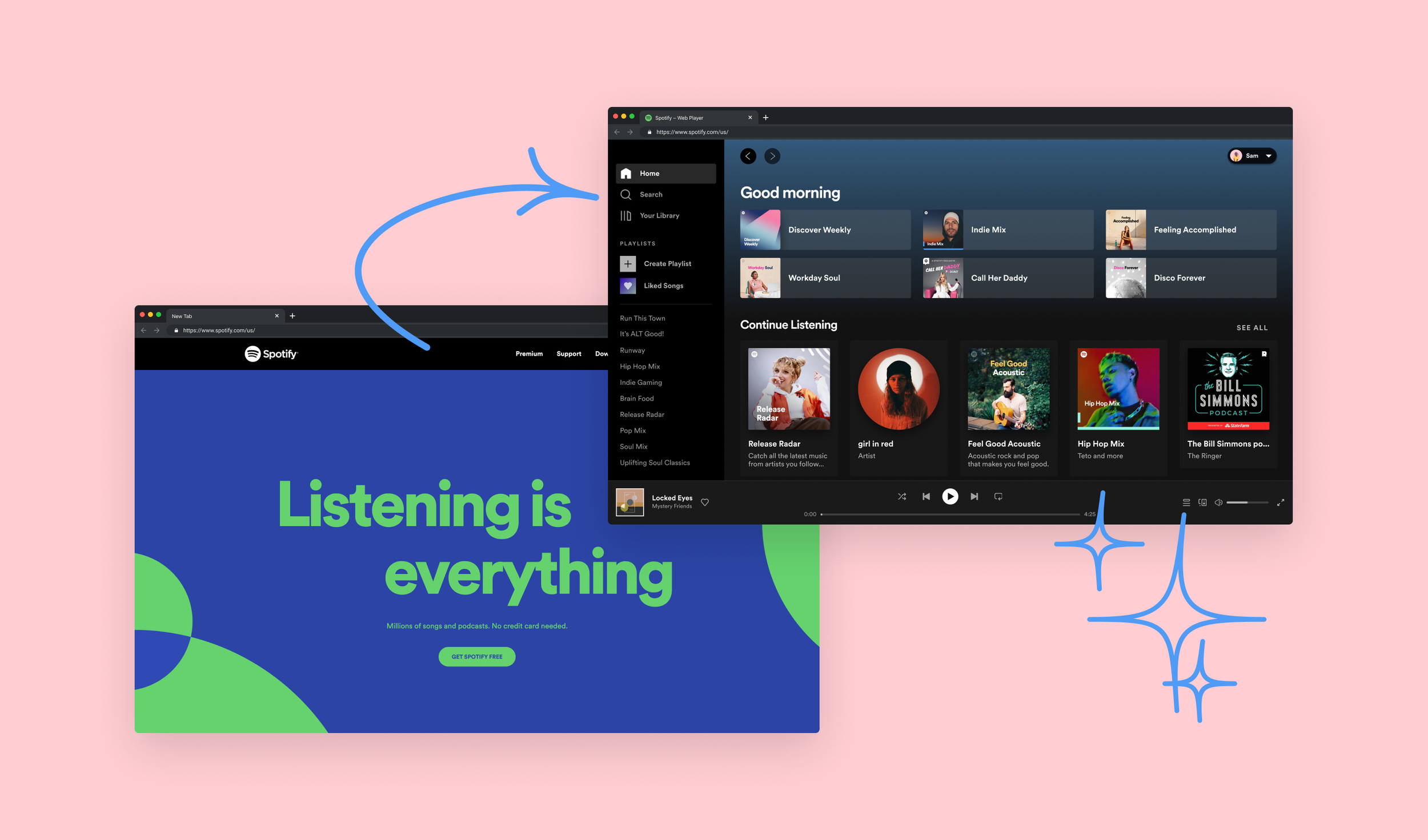
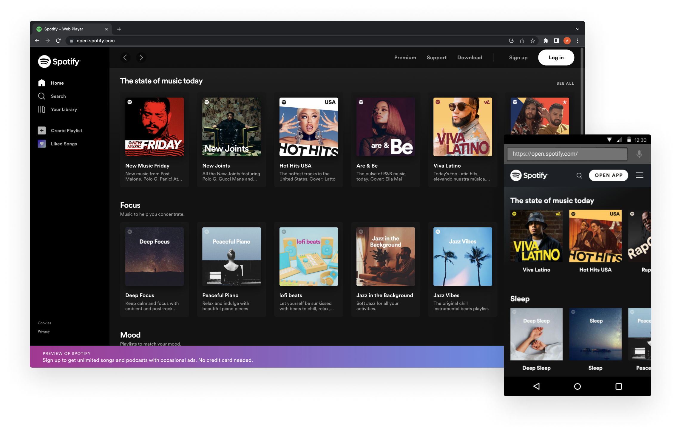
Spotify.com homepage in 2021
The problem
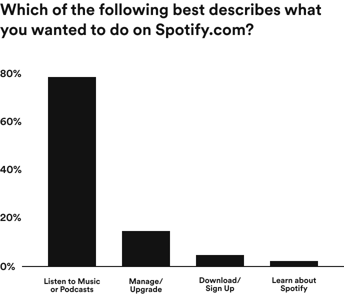
When the team started working on the spotify.com homepage, we found that an overwhelming majority of people who visit want to listen to audio directly on the site (i.e., they’re looking for the web player). But, they had trouble finding it and were frustrated with the amount of friction it took to listen to anything.
Past research had uncovered a high bounce rate on the spotify.com homepage, driven largely by new visitors to the site. On a given day of traffic, an average of half of visitors were leaving the site.
The user journey had grown increasingly complex
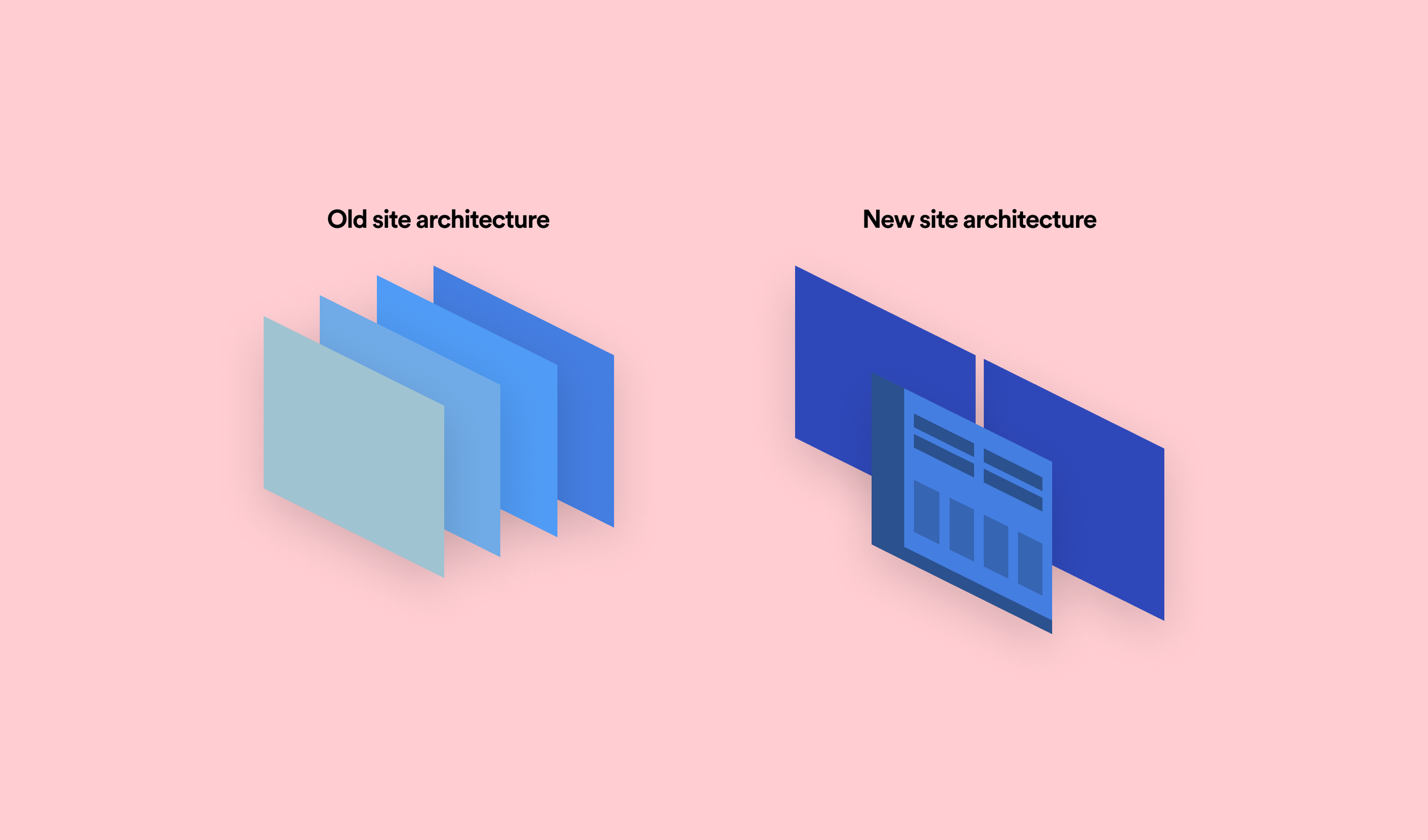
Making improvements to the user journey came with challenges in design, engineering, and experimentation. For one, the site information architecture had grown in complexity over the years as different teams had added new content and elements to the site.
As a result, returning visitors had to rely on old habits to find the web player, like scrolling to the bottom of the page to find the link. Shown in the below user flow, new visitors had several steps before they could play anything.
The previous user journey from landing on the spotify.com homepage to playing audio.
Insights gathering
Before jumping straight into defining a solution, gathering additional insights helped ensure that we were focusing on the right problem. We specifically wanted to understand who comes to spotify.com and what their needs are.
We did this by surfacing an intercept survey to visitors on the site. Our research led us to uncover that an overwhelming majority of visitors come to listen to audio directly on the site, but it’s difficult to find how to do so.

Defining the target audience
After the user researcher gathered insights through surveys and web analytics to help frame our thinking, the next step was to define our most common site visitors, their primary user goals, and the problems that got in the way of reaching them. We developed user personas to uncover and prioritize opportunities so that we could begin exploring how to create the optimal experience for both new and existing users.
The design sprints
After deciding on which concepts were most promising, we created prototypes that would allow us to get feedback from users. The analysis of the user tests informed the new direction for spotify.com: an experience that would give people immediate audio access by landing them on the web player.
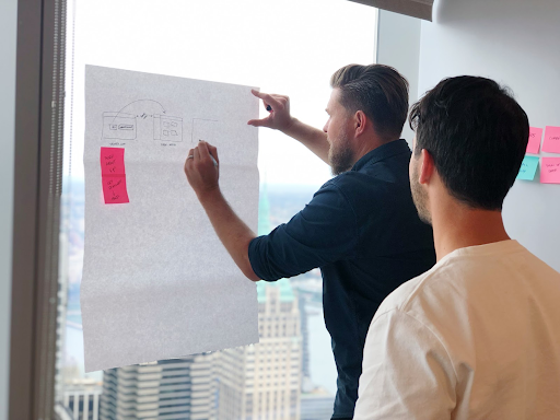
This design sprint allowed the teams to explore different ideas quickly, avoid working in silos, and design a more unified direction of solutions. We continued to work with these teams throughout the project through jam sessions, sprints, and monthly meetings to share updates.
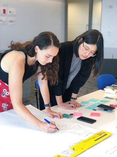
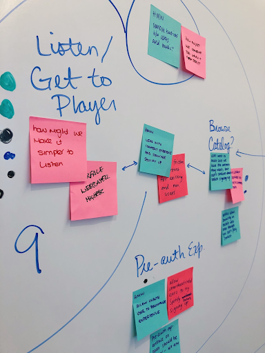
The user personas guided the series of design sprints that followed, in person and remote, in which we invited members of a variety of disciplines — product designers, a UX writer, a product manager, an engineer, and a user researcher — from other web teams that work on spotify.com.
The initial design sprint laid the groundwork for getting everyone on the same page about improving the site. The goal was to share research, agree on a vision, and find better ways to collaborate going forward.
A clear vision
Some ideas explored removing unnecessary steps, making the web player easier to access, or featuring playable content on the homepage. The sprint participants then worked together to narrow down ideas based on user impact, feasibility, and teams’ business goals. These early discussions were crucial in establishing our vision with them to show that we were solving for user and business needs simultaneously.
With a newly defined direction, we worked with a product manager on a bold user-centric vision for the new homepage that would inspire the team, guide the work, help us plan a strong roadmap, and get buy-in from the other web teams. To build support for our vision, we translated it through design concepts and documentation about our goals and strategy, and shared these across the company.
In this vision, spotify.com would provide easy access to audio content, introduce visitors to the brand by showing Spotify instead of just talking about it, and empower visitors to choose how they want to listen, e.g. the Spotify plan, app, or experience that’s right for them.
In order to make sure that visitors could still reach their primary goals, we held another design sprint that focused on improving the site architecture and navigation system. In the MVP design, we’ve carried over the navigation menu and footer on the old spotify.com and re-designed it to be more unified with the web player.
UX principles
We developed a set of principles that would guide our design decisions.
1 – Open
Show Spotify instead of talking about Spotify.
2 – Unified
In-experience formats over mute, bespoke landing pages.
3 – Integrated
One platform and user destination over multiple web properties.
The new homepage
The new homepage drastically reduced the number of steps in the user journey to listening.
Validating design with A/B testing
We knew that changing the spotify.com homepage to the web player would be a major improvement for users, yet we also knew that, because of the page ownership challenges and use of multiple tech stacks to build the site, it would cause a considerable workflow change for other teams. Design and data science collaboration enabled us to validate our way towards the vision incrementally, by breaking down the design into multiple experiments.
In our final test, we saw successful results and that sending spotify.com visitors to the web player significantly increased sign-ups, Premium subscriptions, and retention on Spotify on almost all devices. With millions visiting our homepage daily, this change is expected to bring in 2 million incremental monthly active users!
What we learned
Bring stakeholders in early
We had regular design meetings and sprints throughout this project to make sure we had team alignment and buy-in given the scope of the project. We invited members from different disciplines and other web teams to get a well-rounded perspective of what we wanted to achieve.
Lead with a vision
While including stakeholders in the design process, we created a bold user-centric vision for the new homepage in order to make the future more attainable. It guided the experiments, helped us plan a roadmap, and got commitment from stakeholder teams.
Even failures provide valuable insight
Negative user feedback is often discouraging, but it’s important to spend time understanding the results because it’s possible that a few small changes could flip outcomes. While we saw some failed experiments, we gained valuable insight in understanding the bigger picture of what we needed to do next, including being more strategic with design tweaks in the final experiment we ran.
